|
Well, as a few of you may have seen on my Twitter feed this week... after only one morning using Slidesgo, I think I am addicted! I started using it for my final project for this course, and obviously then began looking around for ways to incorporate it into this week's assignment.
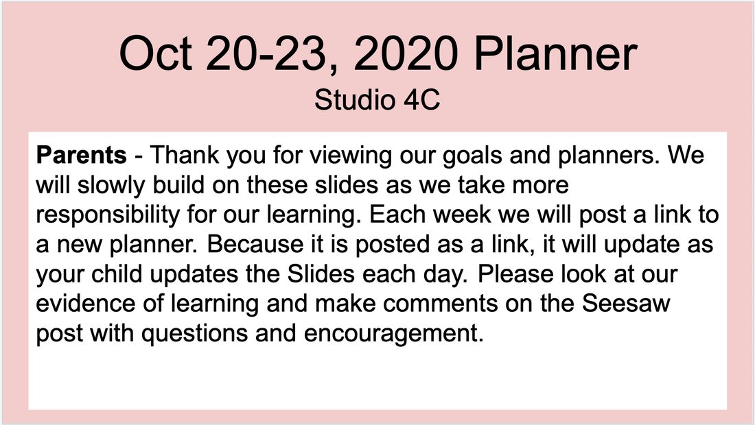
Our school is on holiday this week, so it has been a little more difficult to receive feedback on the thing I wanted to change. I sent out a Google Form to students and parents and am still receiving the feedback, but decided to get started. My student's weekly planner is something that consistently goes through iteration after iteration. It is something that needs to flow and grow with the students, otherwise it is useless. As of now, they have the hang of things and I can start adding a little more. Their planners are shared with their parents each Monday as a live link on Seesaw so they are aware of their child's goals for the week and can see their progress and plans each day. One thing I know I wanted to change was to try to hook parents in a little easier. This thinking came from the parent teacher conferences we had recently (authentic feedback!). Most parents were asking what their child's goals were, and what they were working on each week. This was already being posted on Seesaw weekly, they just were not seeing it. So, without making a million extra posts and notifications in Seesaw, if parents don't click on the link to their planning, could they know more just by glancing at the cover page? YES!
As you can see above, I usually have a message to parents written on the front page of the planning. Originally this was to try to get them to click on it and see the progress through the week. Now I am thinking, if they can see the goals right away and do NOT click on the link... maybe that's still a small win! If they click on it, even better.
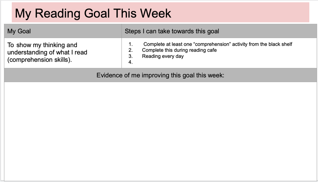
Also, it is a lot less text, and a lot more simple of a design. I would take even more text off, but the purpose is so they can see their child's goals right away. Another thing I changed was their evidence page. I didn't mind it the way it was, and I think the students were fine with it as well, but I wanted two things. 1 - to match the nice new cover page from Slidesgo, and 2- maybe there could be something a little more visual to help them reach their goals.
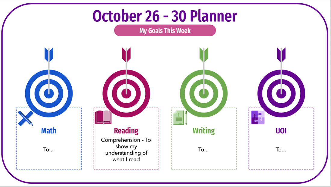
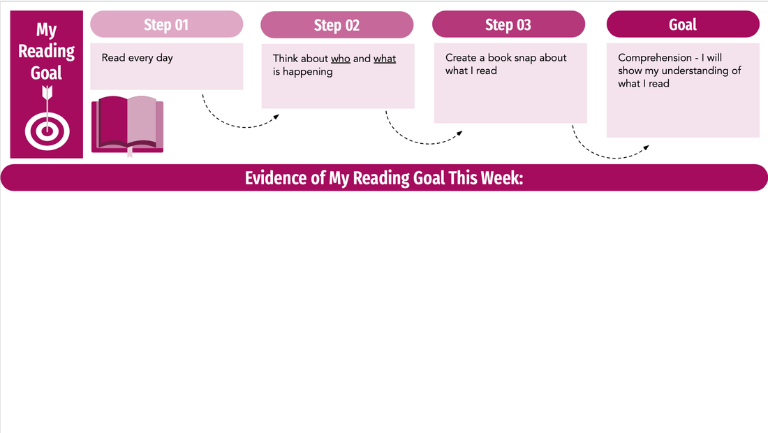
So I adapted another Slidego template in Slides. I think the end result helps to show a better flow for the students. There is a different slide with a different colour for each of their four goals in the week. I actually am wondering if this visual may help them remember to take these steps, rather than just brainstorming what they can do in the week...
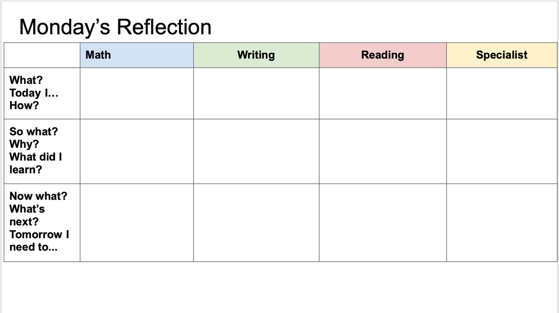
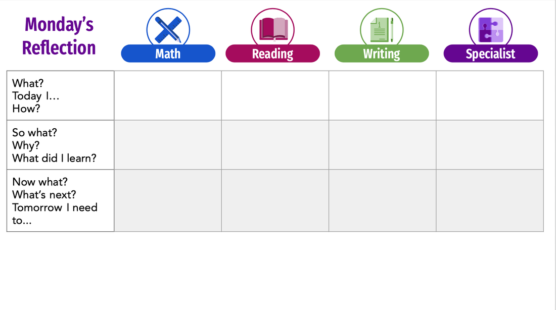
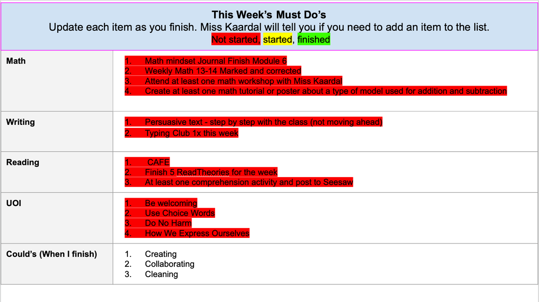
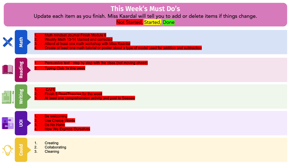
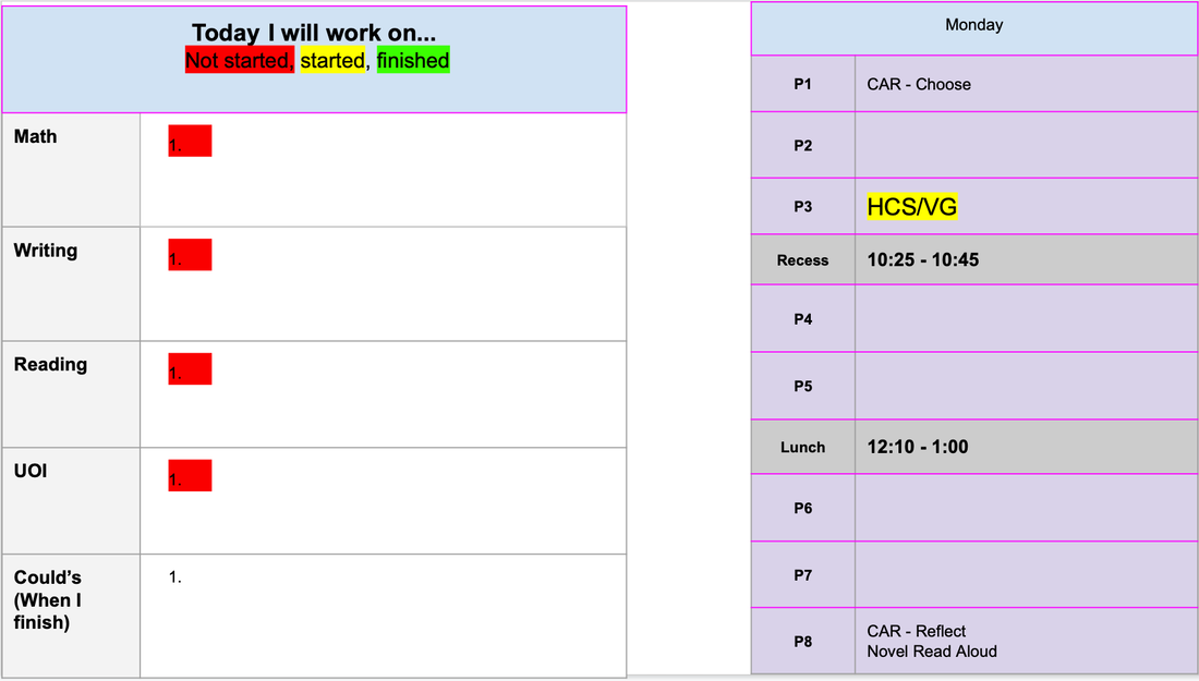
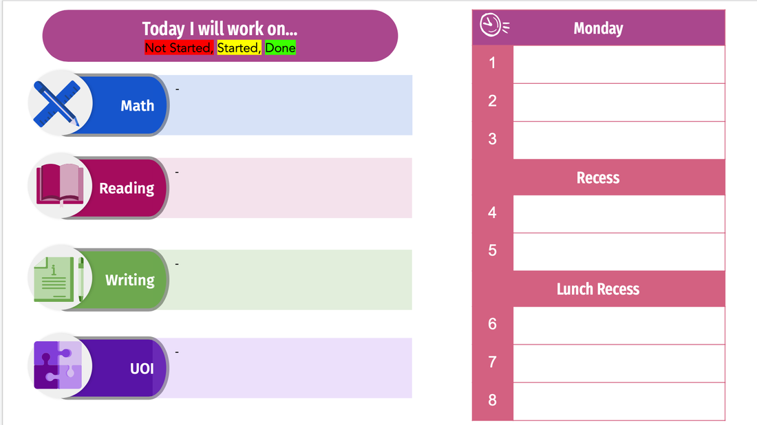
The final things I changed, again mainly for consistency, is their reflection page, their daily planning page, and their weekly musts page. We only just adapted these slides together, so I didn't want to change them too much. They are loving the format of the columns in their reflections (and are producing much deeper reflections because of it), so I mainly just changed the style.
While the function of any of these slides has not changed, I am happy with the design and simplicity of the outcome. I am looking forward to receiving more feedback as it comes in from my parents and students about the planners. Their planner is something that continually changes, and I am excited about these new ones!
Credit to Slidesgo and Freepik for icons and original designs in the slides. 13 Rules to Help You Stop Making Bad Font Choices
Also, as a side note but still connected to this week's assignment, if anyone is interested in reading about how fonts affect your visual communication, this is a great article from the Adobe Spark staff. My colleague shared it with me this week, and it was a fantastic fit!
0 Comments
Your comment will be posted after it is approved.
Leave a Reply. |
Cindy KaardalThis blog page is specifically for my COETAIL blog posts. Archives
April 2021
Categories
All
|
 RSS Feed