|
This was a very timely assignment for me. Our How We Express Ourselves unit has a focus on the concepts of audience and purpose. The first three weeks will focus on speaking and listening, and then later in the year we will return to the unit with a focus on visual language.
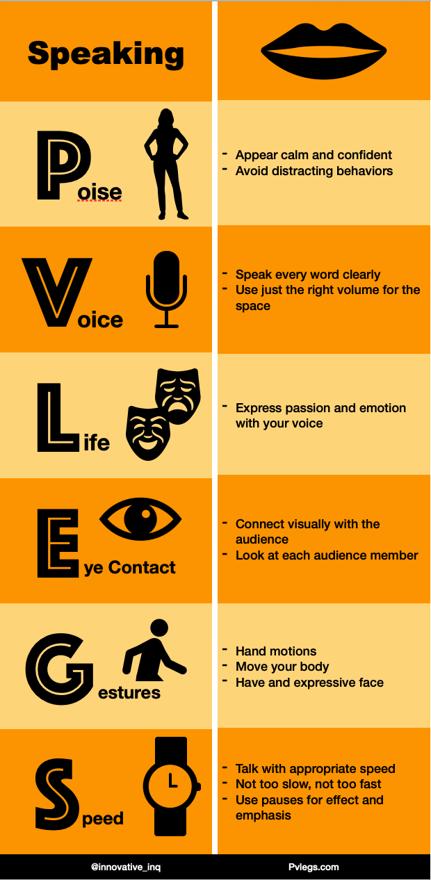
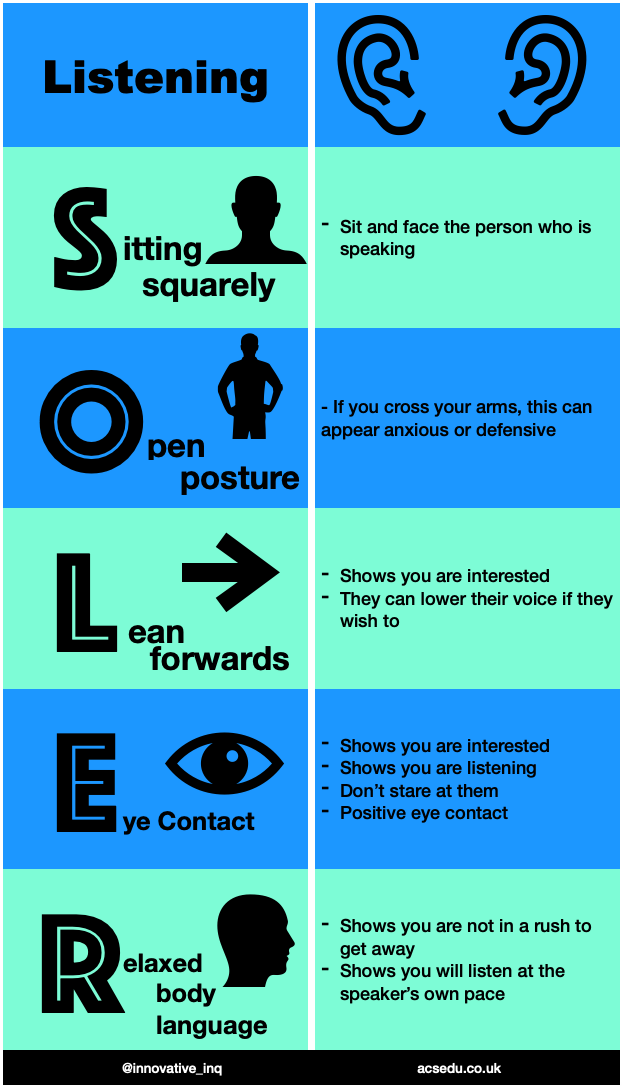
I decided to make two infographics for my students to assist them in this unit. One using an acronym we already decided on as a year group for speaking (PVLEGS), and another one for listening (SOLER). The lists on the right so far come from the websites descriptors, but I will be speaking with my class about what we can put there instead, and create a new version to use with them. Last year we co-created a speaking and listening rubric with them, but we have a slightly different focus this year, and I feel like this activity will be a good way to tie in that golden opportunity of co-creation with them.
I used Apple's Pages to create both infographics. Their library of shapes was large enough for me to choose from. I tried using a few of the other suggested websites at first but felt like Pages would be an easier stepping stone for me, as well as providing more freedom in icons to use for free.
In the future, my students will be creating their own infographics using Pages, as I already have outlined in a previous COETAIL blog post here. I really love the simplicity and creativity that it provides. ... I have an update already! My team had a meeting today about moving this unit forward. We decided that I will create a version of the PVLEGS infographic with the right hand side blank. This will then be used as a graphic organizer for when they are watching different types of verbal communication. They will fill in notes on the right hand side each time they watch something new next week, to get an idea of how people are communicating their ideas. This will be done alongside a graphic organizer that we are already using about audience, as well as a PIE one for purpose (Persuade, Inform, Entertain).
2 Comments
11/1/2020 05:26:33 am
Hey Cindy, Your comment will be posted after it is approved.
Leave a Reply. |

Cindy KaardalThis blog page is specifically for my COETAIL blog posts. Archives
April 2021
Categories
All
|
 RSS Feed