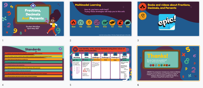
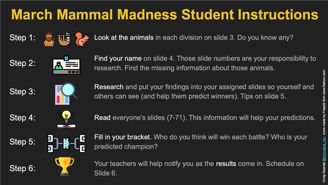
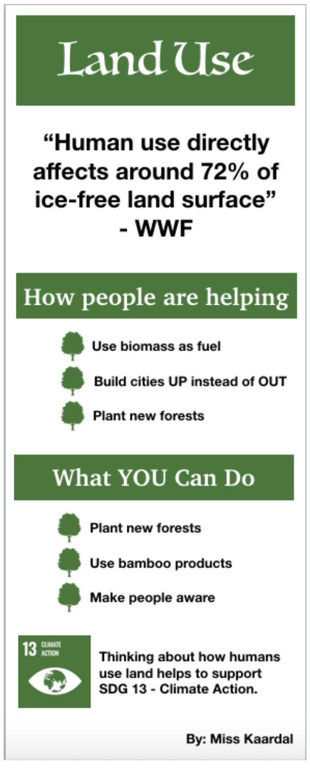
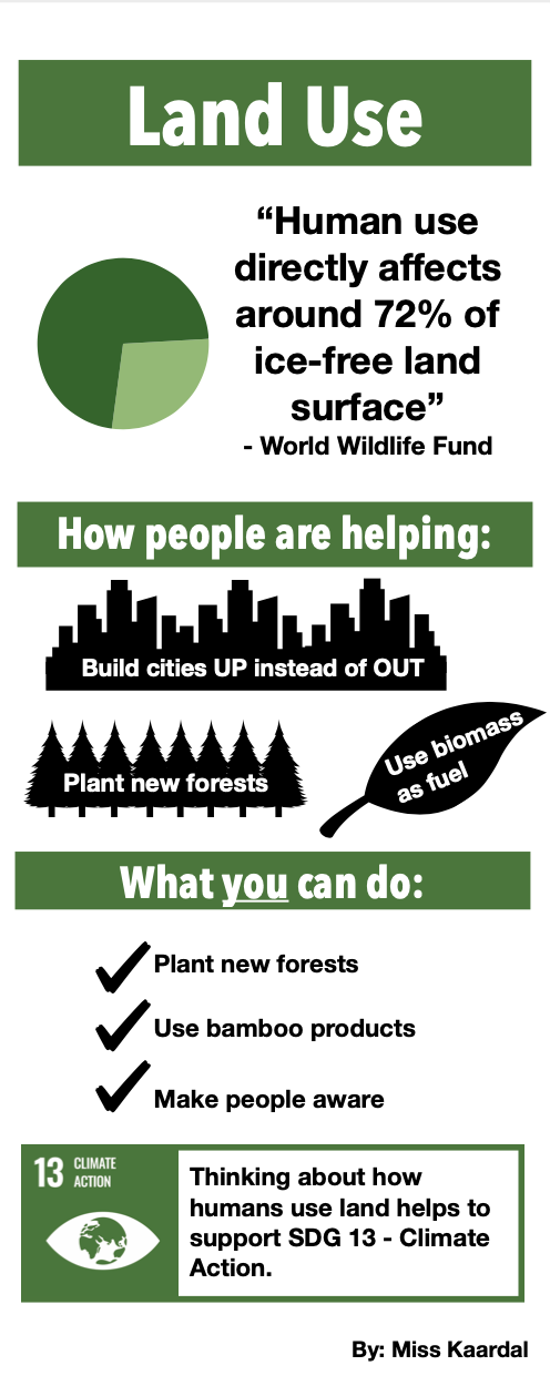
Part 1: ApplicationLesson AlignmentOur readings last week about design principles aligned with this week's tasks and the lessons that I was creating for. For most activities, I revamped some old work I did that is relevant to my students right now. I wanted to challenge myself to improve my design aesthetic and therefore hopefully end up with better quality material to use with my students. Digital Technology Alignment and Design Principles in ActionWhile creating my visuals, CARP was still in my mind. I tend to use more open-ended designing technologies like Slides or Keynote when I am creating visuals. While I know that tools such as Piktochart or Canva are extremely useful (and possibly do look better in the end), I get annoyed when I cannot move things or change things to be exactly how I want them to be. I know that tools like these keep elements like alignment and proximity nicely done for you, as well as some great visuals to include. However, the alignment and proximity guidelines in Keynote and Slides are still helpful, and the shapes in Keynote are almost endless (when you start pulling shapes apart and creating your own). Part 2: ReflectionTechnology UseAfter reviewing the infographic about internet access and use, I was surprised by the numbers. I did not realize how many adults cannot afford or even simply choose not to use the internet. As something that has so much of an impact on my life, I just cannot fathom it. Living abroad, teaching at an international school, even watching TV in English... the internet brings so much connectivity to my life. The solutions posed by OCLC in the infographic are a good start. Action via awareness, discounts, training, and faster networks would be valuable to many people around the world (not just the United States). Stand OutsAside from the above facts about internet access, another stand out to me was how revising previous creations with the purposeful lens of design principles really helped my newest iterations of work. I do not think my original versions were bad, but I can see how coming back to designs with this lens can be powerful. The assignment was not to recreate old designs, but because I create so much as it is, I found this to be the most useful way to approach my tasks this week. Enjoyment and GrowthAnd speaking of that, I can already see my design aesthetic growing and changing. Particularly in the March Mammal Madness slides. Previously, I had used Creative Commons images from within Google Slides. Even though they are labelled as Creative Commons I still get confused as to whether/how they should be attributed, etc. so I moved into using Freepik/Flaticon. Even though they are cartoon clipart pieces, I actually think it looks a lot more pleasing than the images I was using before. I can also see an improvement in the alignment and clarity of some of the slides. Click through a series of before and after screenshots in the slideshow below. For my land use infographic, I am a little torn about which one I like better. I when I compare them now, I do like the simplicity of the original more, but the images did not really relate to the text as much as they could have (besides being trees), which is where I decided to make some changes this time. I am excited to see where my growth in design takes me next.
0 Comments
Your comment will be posted after it is approved.
Leave a Reply. |
Cindy KaardalThis blog page will follow my progress through completing a Master of Arts in Learning, Design, and Technology with Central Michigan University. Archives
April 2022
Categories
All
|
Proudly powered by Weebly


 RSS Feed